von Roland Hachmann | Jan. 19, 2007 | Blog, Digital Culture, Marketing
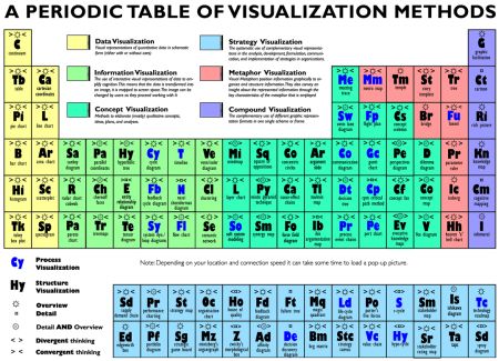
This is an excellent truffle: A Periodic Table of Visualization Methods. Excellent source of inspiration. Some visualisations are known, some are inspiring (at least to me). Here are the categories:
- Data visualisation
- Information visualisation
- concept visualisation
- strategy visualisation
- metaphor visualisation and
- compound visualisation
And the whole thing looks like this:
But you should really click through to the table (made in Flash) itself, because for each of the squares, the visualisation is shown as a popup.
von Roland Hachmann | Dez. 7, 2006 | Blog, Digital Culture, Digital News
I love how you can manipulate or remix datasources in all sorts of ways to achieve „conclusions“ of your choice. This graph, for example shows, that apple is more successful at lower temperatures:

This is from Swivel, a new „community“ for data analysts. You can upload your own data remix, rate other people’s graphs. It’s all the web 2.0 stuff you expect but this time not for pictures, videos or other cool stuff, but rather data. Just data. And of course a lot of graphs.
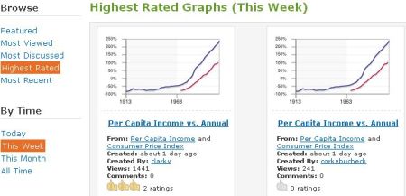
So is this site of any particular use? – I don’t think so.
Will it attact huge crowds like YouTube did? – Not likely.
 Wo ich sonst so bin...