I love how you can manipulate or remix datasources in all sorts of ways to achieve „conclusions“ of your choice. This graph, for example shows, that apple is more successful at lower temperatures:
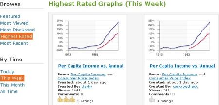
This is from Swivel, a new „community“ for data analysts. You can upload your own data remix, rate other people’s graphs. It’s all the web 2.0 stuff you expect but this time not for pictures, videos or other cool stuff, but rather data. Just data. And of course a lot of graphs.

So is this site of any particular use? – I don’t think so.
Will it attact huge crowds like YouTube did? – Not likely.
 Wo ich sonst so bin...
Roland,
Thank you for posting about Swivel. We do hope that for a lot of people Swivel will be of no particular use but a good time sink nevertheless.
By the way, you can get a slightly nicer version of the Apple – Temperature graph if you click on Blog below it to get something like this: http://www.swivel.com/graphs/share_new/1085944?keep_state=true
which you can embed into your blog post (or just use this image: http://www.swivel.com/graphs/image/1085944)
Best Regards,
Dmitry Dimov
Product Chief & Cofounder
http://www.swivel.com
cool thanks, I have updated the image.
cheers,
roland